
servicesIdentity & Influence
From standout branding to meaningful messaging, I help organizations refine how they show up visually and vocally.
-

Ghost Writing
-

Social Media
-

Brand Identity & Style Guide
-

Digital & Print Creation
Whether giving outdated documents a fresh look, developing a brand identity from scratch, or crafting the language that tells your story, I focus on the details that make your work recognizable and trusted. From ghostwriting and graphic design to strategy and style guides, I’m here to help you shape a presence that truly reflects who you are.

“You brought our vision to life! With a few simple words, you created a logo that speaks volumes!.”
Maribel Vargas-Meza
Community Connector, Relationship Builder, and Advocate for Stronger School-Family Partnerships
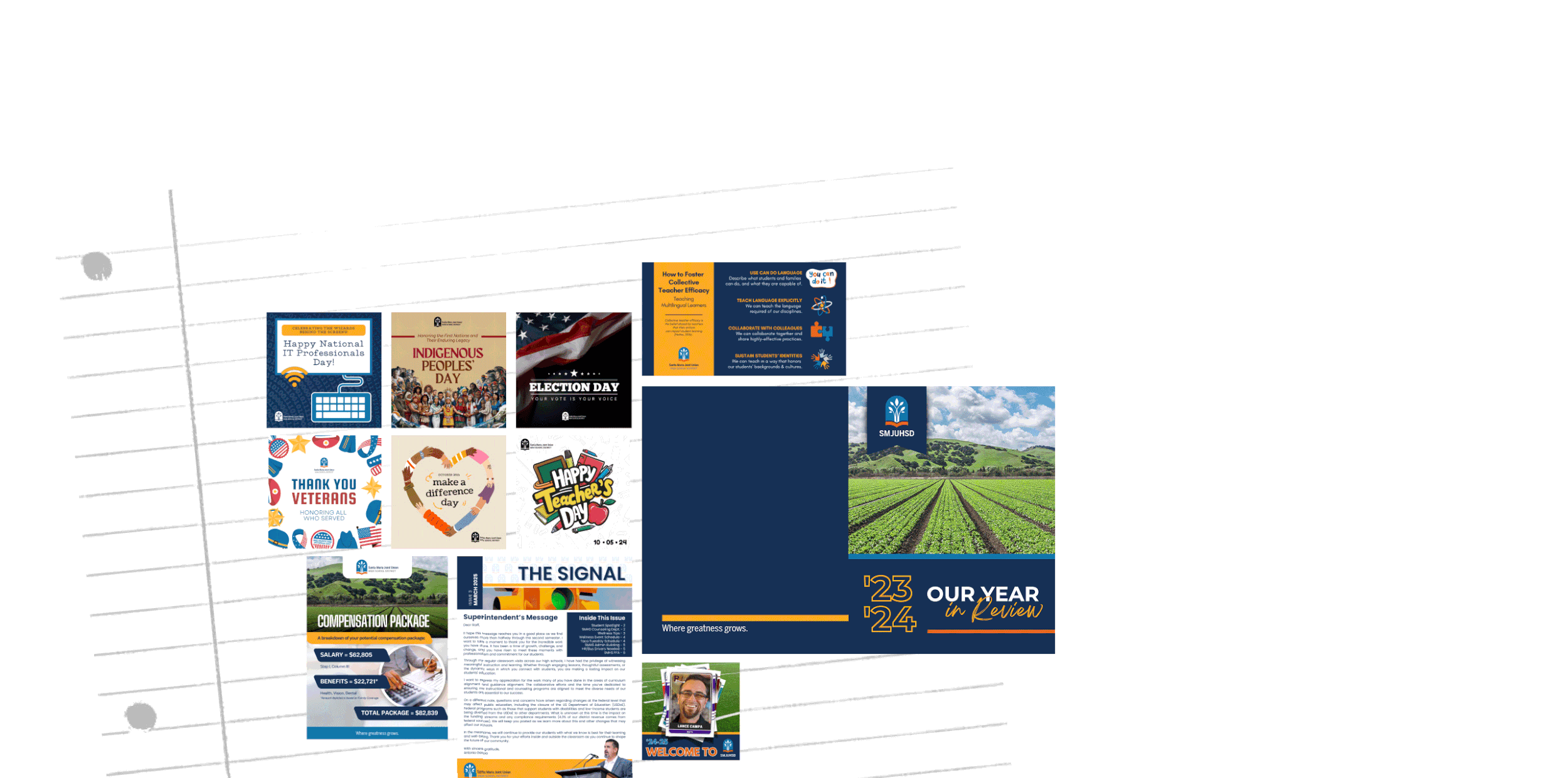
case study SANTA MARIA JOINT UNION HIGH SCHOOL Design, for the District That Deserves to Shine


Digital Materials
From recruitment banners to HR docs and year-in-review reports, I helped Santa Maria Joint Union High School District refresh their identity across multiple touchpoints.
I started by giving their internal documents a professional, polished makeover—improving not just design, but clarity and usability. Next, I tackled high-visibility pieces like public-facing newsletters, branded signage, and a digital “flipping book” to showcase the district’s annual accomplishments.
Everything was guided by a consistent visual identity, clear messaging, and a thoughtful tone so the district could show up with confidence and pride across every audience.

case study SANTA MARIA JOINT UNION HIGH SCHOOLDesign, for the District That Deserves to Shine
Digital Materials
From recruitment banners to HR docs and year-in-review reports, I helped Santa Maria Joint Union High School District refresh their identity across multiple touchpoints.
I started by giving their internal documents a professional, polished makeover—improving not just design, but clarity and usability. Next, I tackled high-visibility pieces like public-facing newsletters, branded signage, and a digital “flipping book” to showcase the district’s annual accomplishments.
Everything was guided by a consistent visual identity, clear messaging, and a thoughtful tone—so the district could show up with confidence and pride across every audience.

“Kimberly is extremely creative and detail-oriented. She creates engaging and visually stunning content.”
Kari Kawa
Collaborative Spirit, Always Brought Good Energy to the Zoom Room, and Proof That a Great Attitude Goes a Long Way in Any Project
case study SANTA MARIA JOINT UNION HIGH SCHOOlA Brand that Honors Industry and Agriculture


Brand Identity
When the Mark Richardson Center needed a visual refresh, I stepped in to help reimagine their identity in a way that was accessible, memorable, and aligned with their mission.
The existing logo and color palette didn’t meet accessibility standards, so I introduced new brand colors that honored the original tone while improving contrast and readability.
I also developed a cleaner, more flexible logo and name treatment that could adapt seamlessly across signage, digital platforms, and marketing materials. With meaningful symbolism—a gear representing industry and a leaf symbolizing agriculture—the new look reflects the Center’s unique blend of programs and purpose. The result is a modern, inclusive identity that truly represents “Growing Greatness.”

case study SANTA MARIA JOINT UNION HIGH SCHOOL A Brand that Honors Industry and Agriculture
Brand Identity
When the Mark Richardson Center needed a visual refresh, I stepped in to help reimagine their identity in a way that was accessible, memorable, and aligned with their mission.
The existing logo and color palette didn’t meet accessibility standards, so I introduced new brand colors that honored the original tone while improving contrast and readability.
I also developed a cleaner, more flexible logo and name treatment that could adapt seamlessly across signage, digital platforms, and marketing materials. With meaningful symbolism—a gear representing industry and a leaf symbolizing agriculture—the new look reflects the Center’s unique blend of programs and purpose. The result is a modern, inclusive identity that truly represents “Growing Greatness.”


contact me about identity & influence